OZOUO Brand Identity System Prompt — Visual Guideline Poster
GPT Image 2 prompt example — copy the text below or click Try this prompt to generate on ImageGen 2.
GPT Image 2 Prompt
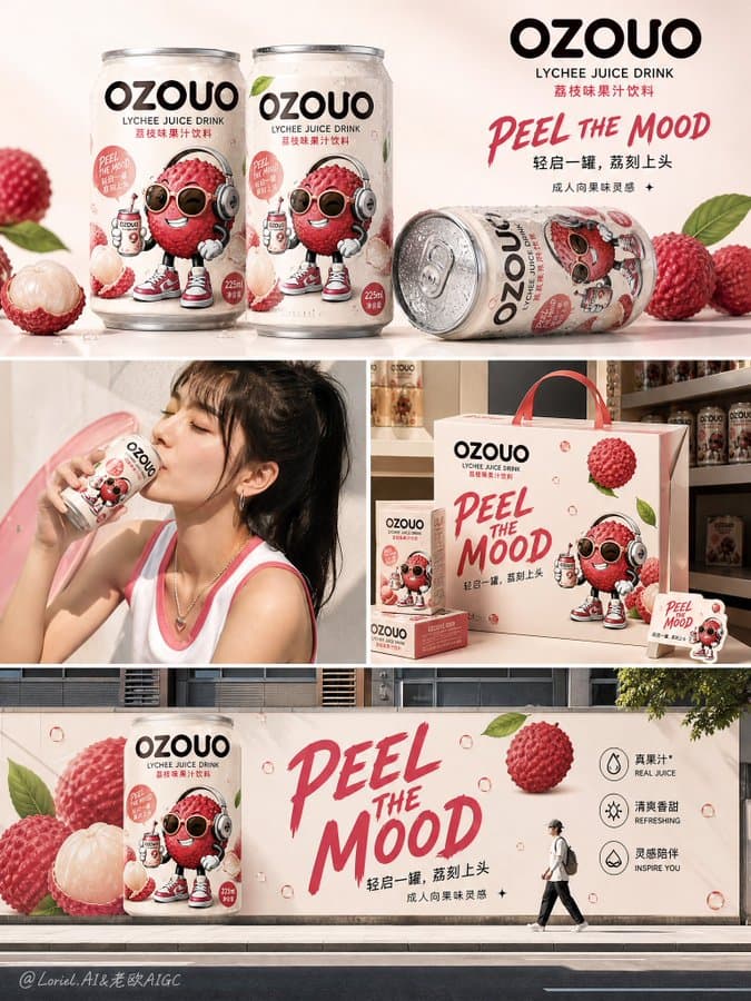
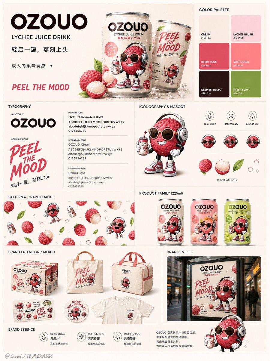
Create the fifth image of the unified visual system for the fruit drink brand "OZOUO", designed as a polished brand identity system board / visual guideline poster. Keep exactly the same brand DNA as the established OZOUO lychee drink system: same OZOUO wordmark style, same 225ml compact can proportion, same adult-oriented lychee mascot, same creamy neutral base, same lychee pink and berry-red accent palette, same deep espresso-brown typography, same slogan tone such as "PEEL THE MOOD", and the same balance between playful and grown-up. This image must serve a different role from the previous packaging sheet, flavor family poster, campaign collage, and retail touchpoint board. Its responsibility is to summarize the OZOUO brand world as a complete identity system, like a modern FMCG brand guideline board. Overall composition: Use a clean modular collage layout on a soft warm beige or creamy background, inspired by a premium brand guideline presentation board. The layout should feel structured, balanced, and highly designed, with multiple rectangular content zones arranged in a neat grid. The whole image should feel like a professional visual identity overview for a real beverage brand. Core sections to include: 1. Brand logo block A large OZOUO logo in the upper area as the main anchor. Show the logo clearly on a clean background, with strong breathing room. Add a short concise brand descriptor such as: "OZOUO" "LYCHEE JUICE DRINK" "成人向果味灵感" "PEEL THE MOOD" 2. Hero can photography Show one or two hero OZOUO 225ml lychee cans in a premium studio product shot with condensation and realistic aluminum finish. The can should be unmistakably the same as the established OZOUO packaging design. 3. Color palette block Present the brand color system in a clean palette section. Use OZOUO's established tones: cream beige, lychee blush pink, berry rose, soft coral, deep espresso brown, fresh leaf green accent. Display them as simple color swatches with a premium guideline feel. 4. Typography block Show the OZOUO typography system with large sample letters and clean hierarchy. Present the logotype style and supporting typography as if this were a real brand manual. The type should feel stylish, rounded, adult-friendly, and shelf-ready. 5. Mascot and icon system block Show the adult-oriented lychee mascot in a clean character presentation area, with one or two supporting graphic icons such as fruit droplets, leaves, bubbles, or tiny expression marks, all in the same OZOUO illustration language. 6. Pattern or graphic motif block Show repeating OZOUO brand motifs such as floating lychee fruits, bubbles, leaf shapes, or simplified mascot repeats, arranged as a clean pattern sample. It should feel graphic and usable across packaging and merch. 7. Product lineup strip Show a row of coordinated OZOUO 225ml cans, preferably lychee plus 2 additional flavor variants in the same brand system, to demonstrate scalability while keeping lychee as the hero flavor. 8. Brand extension / merch block Show one or two brand-extension objects such as a branded carton multipack, tote bag, mini cooler bag, T-shirt, sticker sheet, or display cube, all using the same OZOUO visual system. Keep the application clean and believable. 9. Lifestyle or poster application block Include one small campaign-style visual or lifestyle application image that shows how the OZOUO identity looks in the real world, but keep it secondary to the system layout. Visual tone: The entire board should feel playful, modern, FMCG-ready, graphic, clean, slightly cheeky, and premium. It should look like a true brand identity system board for a youthful fruit drink startup with strong shelf appeal. It must not feel childish, messy, or generic. Flavor continuity: Keep lychee as the lead identity anchor. The mascot, can, fruit elements, and pink accent system should remain clearly rooted in the lychee flavor world established in the existing OZOUO packaging design. Typography suggestions: Use concise text only, such as: "OZOUO" "LYCHEE JUICE DRINK" "PEEL THE MOOD" "轻启一罐,荔刻上头" "成人向果味灵感" "BRAND IDENTITY SYSTEM" "COLOR PALETTE" "TYPOGRAPHY" "ICONOGRAPHY" "PATTERN" "PRODUCT FAMILY" "BRAND ESSENCE" Mood: clean, brand-cohesive, graphic, youthful, adult playful, structured, premium, modern, FMCG, design-forward, presentation-ready, visually memorable. Rendering: hyper-detailed 225ml can mockups, premium print finishes, crisp mascot illustration, clean grid layout, polished studio lighting, realistic merch mockups, brand-guideline aesthetic, 8k, commercially believable. Negative prompt: technical packaging board only, barcode-heavy layout, inconsistent mascot style, random unrelated flavors, childish kids drink branding, messy collage, weak typography system, low detail, mismatched can proportions, generic supermarket branding, cluttered arrangement, inconsistent color palette
Pro Tips
Brand guideline boards need all 9 numbered sections listed explicitly — logo, hero can, palette, typography, mascot/icons, pattern, product strip, merch, lifestyle — or the model collapses into a single packaging sheet. Lock OZOUO DNA upfront ('225ml', lychee mascot, 'PEEL THE MOOD') and use section labels like 'COLOR PALETTE' / 'ICONOGRAPHY' for manual-style clarity.