OZOUO Lychee Brand Campaign Prompt — Lifestyle Launch Collage Board
GPT Image 2 prompt example — copy the text below or click Try this prompt to generate on ImageGen 2.
GPT Image 2 Prompt
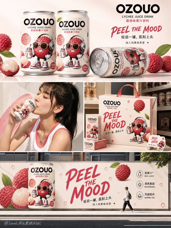
Create the third image of the unified brand visual system for "OZOUO" fruit drinks, keeping exactly the same brand identity, mascot style, typography, packaging language, can proportion, and overall visual DNA as the established OZOUO 225ml lychee drink system. This image must have a different responsibility from the packaging design board and the flavor-family poster: it is a lifestyle campaign application board / brand rollout collage / launch communication visual. Core role: This image should present how the OZOUO brand lives in the real world through a multi-scene campaign collage. It should feel like a launch-ready marketing board that shows product beauty shots, lifestyle use, merchandising, and outdoor brand impact, all within one coherent poster. The image must clearly belong to the same OZOUO brand system, not a different brand. Overall composition: Use a clean multi-panel collage layout inspired by a modern FMCG launch board. Arrange the composition in 4 sections with strong visual clarity and breathing room: top section: hero can lineup / product beauty shot middle left: lifestyle drinking moment middle right: branded merchandising or gift box / retail display scene bottom section: bold outdoor campaign or oversized billboard / street poster application The whole image should feel clean, stylish, youthful, and commercially convincing. Brand consistency: Keep exactly the same OZOUO system from the existing reference: same "OZOUO" wordmark same 225ml compact can proportion same lychee flavor hero design same adult-oriented cartoon lychee mascot same creamy neutral base and lychee-pink accent palette same premium FMCG realism same slogan language such as "PEEL THE MOOD" same balance between cute and grown-up The image must feel like a natural continuation of the same brand universe. Flavor focus: Keep lychee as the hero flavor to maintain continuity. The can design, fruit visuals, mascot, and tone should stay aligned with the established lychee packaging system. The hero can should appear fresh, cold, and premium, with realistic condensation and polished aluminum texture. Scene 1, top section: Show two or three OZOUO 225ml lychee cans in a product beauty composition. They can be standing and lying down on a clean surface, with condensation droplets, realistic shadows, and a fresh premium feel. Keep the styling minimal, not cluttered. This scene should showcase the can as a real product hero. Scene 2, middle left: Show a real lifestyle moment of a person drinking OZOUO lychee. Only partial figure or cropped portrait is needed. The person should feel young adult, stylish, modern, and brand-appropriate. The can remains clearly visible. The mood should feel refreshing, social-media friendly, and natural, not like a generic stock photo. Scene 3, middle right: Show OZOUO brand extension into a compact merch or retail-display scene, such as stacked branded gift boxes, point-of-sale display cubes, or small launch-kit packaging in the same visual system. The boxes should use the same mascot, same typography, same lychee color palette, and same clean branding language. This section proves the brand system can expand beyond the can. Scene 4, bottom section: Show a bold outdoor campaign application: an oversized OZOUO lychee can mural, billboard, or wall poster in an urban setting. Keep it clean and graphic, with a giant can or giant slogan displayed on a wall, poster board, or branded street-facing surface. Add one small walking person or urban figure for scale. This section should show the brand's public presence and visual impact. Typography: Typography should be a major brand asset but remain concise and controlled. Use the same OZOUO style as the established system: bold, rounded, adult-friendly, shelf-ready, stylish, and clean. Include text such as: "OZOUO" "LYCHEE JUICE DRINK" "PEEL THE MOOD" "轻启一罐,荔刻上头" "成人向果味灵感" For the outdoor campaign section, use one short bold slogan such as: "PEEL THE MOOD" or "一罐进入果味状态" Do not add too much copy. Keep the text strategic, visual, and brand-consistent. Visual style: The whole board should feel like a polished launch campaign presentation for a modern fruit drink startup: clean, graphic, adult playful, social-media ready, retail-ready, brand-cohesive, stylish, fresh, premium, commercially believable. It should not feel like four unrelated images. All scenes must be tied together by the same color system, can design, typography, mascot style, and tone of voice. Color palette: Use the established OZOUO lychee palette: creamy warm beige, soft blush pink, lychee rose, berry-pink accents, deep espresso-brown typography, small fresh green leaf accents. The campaign board should feel consistent and recognizable as the same brand family. Rendering: hyper-detailed 225ml can mockups, realistic lifestyle photography, polished merch mockups, branded outdoor application, soft studio shadows, clean composition, premium FMCG campaign presentation, 8k, commercially believable, visually memorable. Negative prompt: technical packaging layout repeated, barcode-heavy board, inconsistent can proportions, different mascot style, childish kids drink brand, messy collage, random backgrounds, weak brand identity, too many flavors, low detail, generic stock-photo ad, unrelated urban billboard design
Pro Tips
Brand rollout boards need four labeled sections (top hero / middle-left lifestyle / middle-right merch / bottom outdoor) plus locked DNA ('225ml can', mascot, 'PEEL THE MOOD') — without section roles the collage reads as random FMCG photos. This is image 3 in a system: reference the established OZOUO packaging first, then apply the Negative prompt to block inconsistent proportions and childish kids-drink styling.